

After a friend, Ali, came to me for advise on stripping the wallpaper in her kitchen, I neglected to ask when her house was built. The exterior looks very post 1960's, so I thought perhaps there were traces of lead but not super heavy.
The house was built about 100 years ago. Crap.
This means there is a dangerously high level of lead content in just about everything, but especially paint and moldings.
Didn't know this when we began aggressively pulling down the wallpaper one spontaneous morning visit. I went home for the day and got a panicked call from Ali the next night, saying she had gotten a home lead test kit (smart girl) and it cam back really red (red is bad). I immediately came over to seal up the walls with caulking, joint compound, and 2 coats of heavy primer. We wore heavy duty ventilating masks and kept areas wet and clean, as is advisable. We also sealed off all doors with plastic covering so the kids wouldn't be exposed. But this is the hub of the home - and the kids are hungry, and restless, and easily entertained by pulling each other's hair. So we had to act fast.
From Wednesday to Saturday, we stripped, panicked, sealed, and were safe.

Sigh. Rest. Breathe. Aaaaand hold onto your hammers, girls, cuz it's time to talk kitchen remodel...
She had a hodge podge of leftover kitchen cabinets from about every decade except her own. Good points included vintage upper cabinets above the sink with antique hardware. I'm smelling a jumping off point.
Vintage casual.
We will bead board six feet up the walls. This will create a stylish, vintage casual backdrop for the walls and add architectural interest. Meanwhile, it will better seal up any of the lead behind it and won't reveal paint chips of bumped. Plus, nicks and scratches to the bead board will be enhanced patina, versus walls that will just look like they need repair. Character, safety, and durability. We will paint above the bead board - potentially all the way through the ceiling, unifying ceiling and walls - to add color in an area that won't be getting knocked and crashed into by running children.
Here's the bullet-pointed color/material scheme for the budget-friendly, vintage-inspired remodel (all pics borrowed from Google):
These floors:

With these butcher block countertops:

With white subway tile backsplash behind sink, contrasted with Taupe grout, sort of like below but a lighter grout:

With this beadboard going up the walls 6 ft (higher than wainscoting, lower than a plate rail):

Something like these porcelain vintage knobs (bronze or polished chrome?) to pop against chocolate base cabs (maybe bronze or polished chrome on white upper cabs):


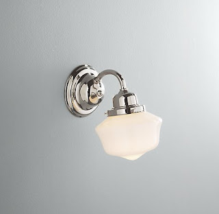
Wall sconce replacement - school house style to go with age of house:

Fan replacement:

And these base cabinets:

New cabinets: These Ikea cabinets have the rich, dark, traditional feel Ali loves and will go nicely with the glossy white bead board.
mid-tone wood laminate floor: clicks together and floats on top of vinyl tile and who know what lurking underneath. Super durable with kids and budget friendly. And they had already bought it! Good timing.
Now I know what your thinking: "But the wood tones don't match! Shouldn't she get darker floors or lighter cabinets to match?" Not necessarily. It creates more interest in a room, as long as it can be pulled off by repeating those colors somewhere else. It has to look deliberate. So we'll bring the brown of the cabinets into a bronze hardware and the tan of the floors in the grout of a white subway tile back splash, and perhaps in a tan paint color.
So then our color scheme show up in the following way:
Creamy White: vintage cabinets, bead board, trim, porcelain hardward
Tan: flooring, grout, paint color on walls
Chocolate: base cabinets, hardware
As for layout, the kitchen maneuvers as a galley style right now, which is hugely limited in terms of functionality and storage. I'd like to move the gas line and wrap in a cooking peninsula to anchor a benched seating nook behind.
(insert kitchen lay out here...teaser...)
They also have a chimney in prime real estate, so a shallow depth pantry could create a seamless face from one side to the other and maximize storage.
When you walk into the house, you're immediately in the kitchen. So the dead space behind the front door can act as a moment of entry way by adding coat hooks, and a shoe bench/trunk for storage and taking shoes/coat on and off. Perhaps I can put a wall mail sorter, key ring, etc there, too.
More to come... Would love some feedback, sources, anything you can offer, as always! Thanks gang!
