Friday, August 20, 2010

Wendy's Attic

A Butter yellow from the living room and a cobalt blue from the Dining room...do not a pretty attic make.

To establish this as continued living space, like the living room, we continued the same color scheme. Repairing the window casing and painting it a fresh, semi-gloos "Greek Villa" white link it to the new trim color all over the house (trim was the most time consuming part of the project). "Softer Tan" covered the walls, and "Dapper Tan" with "Greek Villa" made a new runner for some really beat-up, chalky white stairs.

I don't have before pictures, but imagine a yellow room with blue surrounding the architerural nooks, giving it a highly segmented look that emphasied the funky angles rather than blending them into one large bonus room.

AFTER:


Wendy's Entry way and Living Room

Neutral tones and floor plan were the focus here. The butter yellow was too saturated for the buyers' market. And we needed to distinguish the entry way from the living room, while making the fireplace the focal point for the room.

We chose "Softer Tan" from Sherwin Williams, a pale taupe gray that I now want in my house. So sophisticated and refreshing. We replaced the minty green with "Dapper Tan" for the built-ins flanking the fireplace because it pulled a rich dark tone out of the stone work and expanded it onto the shelving. Some mirrors, neutral b/w photographs, and some "I have oodles of taste" orchids, and poof!

I also positioned the couch in the way I did for two reasons:

1. It faces the fireplace - the star of the room.

2. It establishes to start of the living room and end of the entry way.

The Entry got a console and mirror - a last-minute "check your make-up" moment next to the front door, not to mention a place to drop shooes, keys, and loose change, in a house with no first floor coat closet.

Enjoy.

Before:


After:


Wednesday, August 18, 2010

Wendy's Breakfast Nook

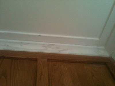
A lot of molding repair: scraping, sanding, caulking, painting, etc. We still need to add the curtains, so will add curtain pictures later. I wanted to off-dining room to be a special breakfast area where one could read the paper and sip coffee, while draped in clean fresh fabric that brought the "breakfast in bed" luxary to the first floor. Crispt, white linen on the table, seat cushions, and later curtains...ooh la la.

But those tablecloths, table, and chairs had to go to San Diego. What's left are the soft cool glow of curtains wrapping the breakfast nook with purpose. Like a Genie in a bottle, but with light and pastries... kinda feel.

Enjoy!


BEFORE:


AFTER:


Wendy's Dining Room

Bye bye blue, complete with faded color surrounding the sillouhette of old frames from the countless paintings and photos taken by the amazing artists of the house. Unfortunately, buyers want to buy the house, not the artwork, so it had to go. In it's place, we did a white - one shade up from the living room color - to emphasize the contrast between walls and moldings. The woodwoork needs to be the star in this room.

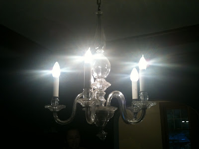
We continued certain finishes consistently through the eating areas: white, glass, and pewter. The mantle became a vinette for these finishes while black and white, neutral subject photos completed the room. This played off of the existing chandelier beautifully. They were hung between the plate rail and the top of the door casing, bringing them down to an arts and crafts flavored height.

Before:


After:


Wendy's Butler's Pantry

After 100+ hours of painting, caulking, spackling, scraping, priming, puddying, sanding, cleaning, organizing, purging, and staging... The Chapmans will leave us officially tomorrow when the movers come. We will miss you, Chapman clan! Thanks for your warmth, honesty, charity, and good humor.

The schedule for the move was erratic, at best. They didn't have the relief of knowing whan they would move, who would move them, where they would move into, how long to stage for, etc. And in usual Chapman fashion, everything kinda serendipitously came together for them.

The staging, however, was short-lived (maybe 2 weeks finished before movers came and took it all away). I didn't even get a chance to take pictures of some of the staging before it all had to be boxed up! Such a bummer, but that was the circumstances from the get-go. Unknown, and doing the best yuh could with what yuh knew.

The plan was to repair/paint all four floors fo the house, change some light fixtures, add some curtains, organize, purge, and light and decorate for the buying market. We did most of that. Wendy and Claire even picking up a brush now and then and joined me in an effort to finish asap. The result was striking!

We'll do this one blog at a time. Butler's Pantry:

This was a random extra room (one of several on the first floor) that needed a purpose. It extended storage for the kitchen and ajoined the breakfast nook and dining room - hence "butler's pantry".

The valance hangs from the ceiling to maximaze feeling of height. It runs across both windows to unify and expand them. And it distracts from the fact that there is no window casing.

We added mason jars (which you know I love) and labeled them, conjuring up images for buyers of gourmet cooking and fancy, well-cared for ingredients. With the wine rack, we also added the buffet that was previously crowding the dining room and made it a buffet/drink serving station with some rich, sophisticated looking pewter dishware.

Before:


After: