Bye bye blue, complete with faded color surrounding the sillouhette of old frames from the countless paintings and photos taken by the amazing artists of the house. Unfortunately, buyers want to buy the house, not the artwork, so it had to go. In it's place, we did a white - one shade up from the living room color - to emphasize the contrast between walls and moldings. The woodwoork needs to be the star in this room.
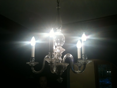
We continued certain finishes consistently through the eating areas: white, glass, and pewter. The mantle became a vinette for these finishes while black and white, neutral subject photos completed the room. This played off of the existing chandelier beautifully. They were hung between the plate rail and the top of the door casing, bringing them down to an arts and crafts flavored height.
Before:
After:
Wednesday, August 18, 2010
Subscribe to:
Post Comments (Atom)
No comments:
Post a Comment